
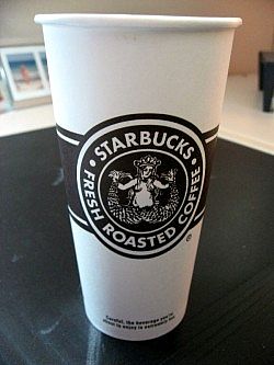
You may have been wondering about Starbucks' new branding, namely their new Pike Place roast and brown logo-ed cups and sleeves. An interesting article on Business Week's website answered a few of my questions, but mostly it just confirmed the information I've heard on the street. I decided to go in search of more info about the logo itself. This article focuses on the logo's origin and how the siren has changed since 1971.
Interesting. The Pike Place roast is actually good, and I've been a lifelong critic of SBux's "burnt" drip blends.
tbw.


No comments:
Post a Comment